In one of the last posts, I linked to a visualization I like a lot--Ben Schmidt's 100 Years of Ships based on ship records digitized for climate data research. As it happened, I was thinking about this visualization when I came across KGB records of ships arriving in Soviet Ukraine from abroad. They are great sources, but only a handful of ships arrived each month, the coordinates of their journey were not given and the reports weren't regular. I thought about trying to put together a visualization from them, but they can't produce a shipping map like the shipping records from the 18th and 19th centuries. Nonetheless, the records led me to think about mobility within the USSR and the socialist bloc. Most people who have been to the former USSR have done some train travel, which has a long history (part of which, the cheapo platskart section, is coming to an end). However, it struck me that I didn't know that much about how the Soviet Union flew. It also seemed obvious that flights would make an interesting visualization, and one that could be revealing for thinking about how technology and social geography influenced travel.
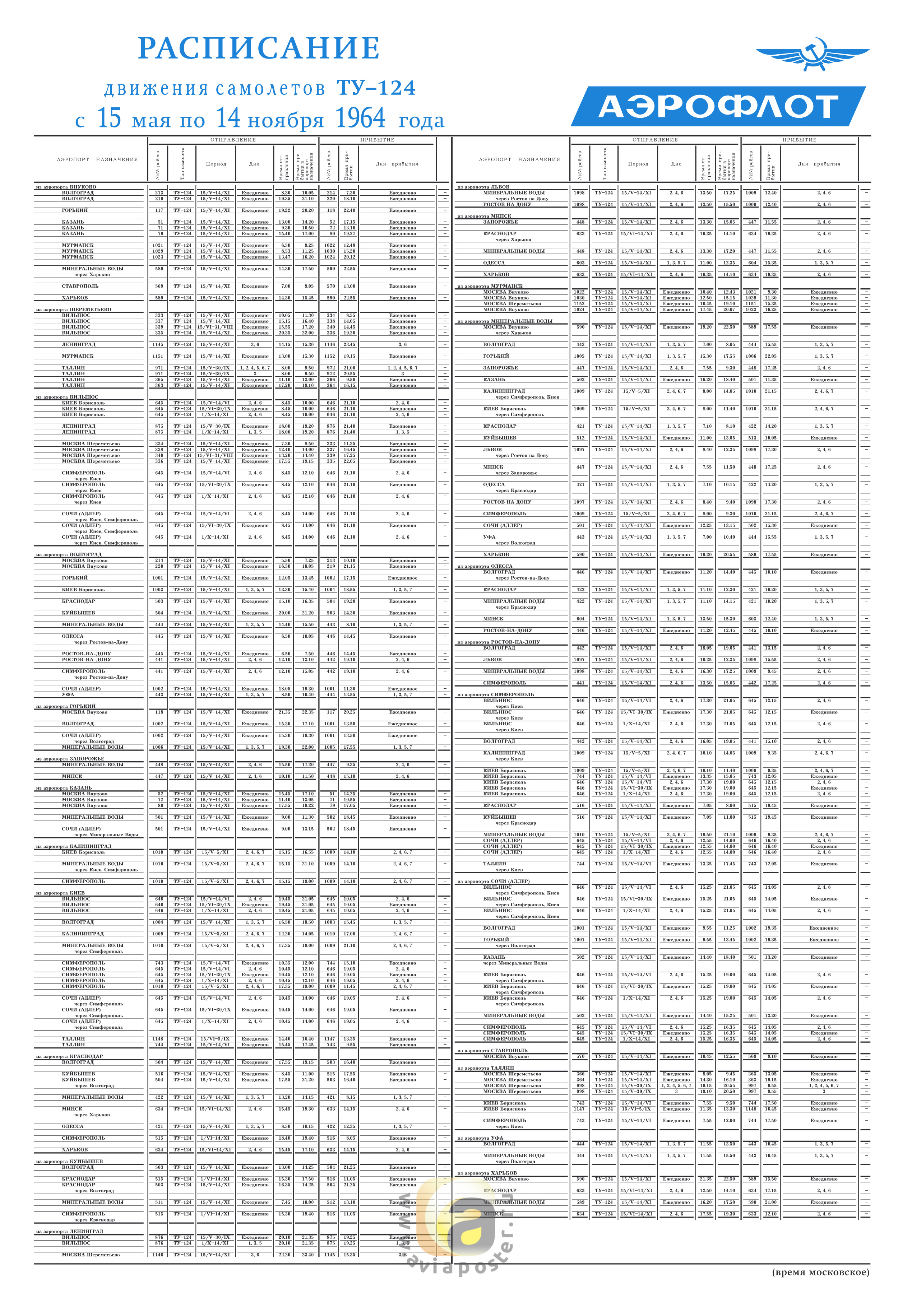
I dug around a bit and found that plane enthusiasts are digitizing old Aeroflot flight schedules. This site is full of scanned timetables, like this one for Moscow from 1964:
What really interested me was not just looking at one city's schedule but putting together the whole air network, at least for a limited period of time. The owner of a Russian site called Avia History put up a large number of spreadsheets with timetables. Even better, it has time tables from seven cities for the summer of 1948: Adler (Sochi), Kiev, Leningrad, Moscow, Novosibirsk, Simferopol and Sverdlovsk (Ekaterinburg). Using these schedules, I came up with a visualization of the flight routes from tht year, represented as beginning on one day (but lasting three days in the case of routes with multiple stops):
And here is a longer video (~12 minutes but with music, so maybe people will stick with it for a few minutes) with the May 5 to September 14. It's worth watching at least a little of this video, since it gives a sense of the daily rhythms of the network. If you watch a month or two, the flights shifted somewhat to the south to the Caucasus and Crimea as the Soviet Union went on vacation.
Here is how I made these videos: I geocoded the start and end location of each flight, figured out the time between takeoff city and destination, and orientation of the plane. Then, for each flight I generated the location and orientation of the plane every five minutes as if it was traveling in a direct line to the destination at an equal speed the entire time. I exported this flight path plus color coding for flight type to a csv (see here). For the long flight video, I exported every flight for each day the flight was scheduled from May 5 to September 14. Then, I took the spreadsheet for use as a time layer using QGIS and TimeManager, following the same steps from the previous post about mapping the gulag.
Before I start analyzing what these clips and the data in general reveal about flight in the early postwar USSR, I'll mention caveats. The person who put up the spreadsheets does not give the source for the data in for the 1948 spreadsheets. Spreadsheets from other years give a source--an official timetable or a regional newspaper. I am assuming these timetables come from a similar source, although my attempts to contact the site's owner did not produce any results.
These are Aeroflot flights, that is, civil aviation (passenger, mail and cargo). They passed through, began or ended in one of the cities that I was able to find data for. This simulation probably captures 95+ percent of non-military flights. Obviously, having the schedule of every city would have been ideal. However, these flight schedules carried the entire route a plane took. So, for instance, both the Adler and Moscow timetables give Flight 208 as Adler-Moscow but the flight route went Tbilisi-Adler-Krasnodar-Rostov-Voronezh-Moscow. Those other flights (e.g., Tbilisi-Adler) are all listed in the schedule as well. For this reason, I don't think that having the Kazan' or Kuibyshev (Samara) schedules would add many, or any, flights, even though they are two of the biggest nodes in the network. How many flight routes would have originated in those cities that didn't also go through Moscow, Sverdlovsk or Leningrad? The two schedules that are most lacking are probably Khabarovsk and Tashkent, since some flights to distant locales may have originated there.
This is a simulation of the flight schedule, not the actual flights. Weather put flights off course, there were mechanical errors, accidents and so on. The planes take a linear route from their city of departure to their destination, unlike in reality. The visualization 100 Years of Shipping used captain's logs from each trip, which plotted the course of ships with a high level of detail. I don't even have both the exact departure and arrival times. Instead, the schedules show when a plane arrives in one city and when it arrives in the next and do not provide for layovers. This is especially visible on the long-haul Moscow-Siberia-Far East flight routes that took two days. In the simulation, it seems like the plane flying the whole night. Obviously, that is impossible. However, I didn't want to guess what the layover times were so readers will have to interpret very slowly moving nighttime planes as Soviets enjoying Siberian layovers. A similar problem is that one flight (Gorkii-Leningrad) gives what may be too fast a time and zooms by once every couple days.
Caveats aside, these visualizations reveal interesting aspects of how Soviet transport networks operated, the relationship of the provinces to the center and how technology and distance affected travel in the USSR. Putting together this visualization was made easier because the state-run Soviet civil air system was very centralized, unlike in the United States where there were many commercial airlines, private planes and so on.
The big thing to note about air travel in this period was that its structure was more like long-haul train travel. Of just over a thousand different flights, 822 were part of a route with multiple stops. Of the 284 multiple-stop routes, 107 were two-hops like Moscow-Leningrad-Helsinki and another 72 were three-hops, like Moscow-Voronezh-Rostov-Krasnodar. There were 105 multi-stop routes that had four or more hops, including a route (and its reverse) with ten stops: Moscow-Kazan'-Sverdlovsk-Omsk-Novosibirsk-Krasnoiarsk-Irkutsk-Chita-Takhtamygda-Tygda-Khabarovsk. Many of them also combined passenger service with cargo and mail delivery. Here is a map of the flight network that illustrates this point about the multi-leggedness of Soviet air travel in 1948:

I dug around a bit and found that plane enthusiasts are digitizing old Aeroflot flight schedules. This site is full of scanned timetables, like this one for Moscow from 1964:
What really interested me was not just looking at one city's schedule but putting together the whole air network, at least for a limited period of time. The owner of a Russian site called Avia History put up a large number of spreadsheets with timetables. Even better, it has time tables from seven cities for the summer of 1948: Adler (Sochi), Kiev, Leningrad, Moscow, Novosibirsk, Simferopol and Sverdlovsk (Ekaterinburg). Using these schedules, I came up with a visualization of the flight routes from tht year, represented as beginning on one day (but lasting three days in the case of routes with multiple stops):
Before I start analyzing what these clips and the data in general reveal about flight in the early postwar USSR, I'll mention caveats. The person who put up the spreadsheets does not give the source for the data in for the 1948 spreadsheets. Spreadsheets from other years give a source--an official timetable or a regional newspaper. I am assuming these timetables come from a similar source, although my attempts to contact the site's owner did not produce any results.
These are Aeroflot flights, that is, civil aviation (passenger, mail and cargo). They passed through, began or ended in one of the cities that I was able to find data for. This simulation probably captures 95+ percent of non-military flights. Obviously, having the schedule of every city would have been ideal. However, these flight schedules carried the entire route a plane took. So, for instance, both the Adler and Moscow timetables give Flight 208 as Adler-Moscow but the flight route went Tbilisi-Adler-Krasnodar-Rostov-Voronezh-Moscow. Those other flights (e.g., Tbilisi-Adler) are all listed in the schedule as well. For this reason, I don't think that having the Kazan' or Kuibyshev (Samara) schedules would add many, or any, flights, even though they are two of the biggest nodes in the network. How many flight routes would have originated in those cities that didn't also go through Moscow, Sverdlovsk or Leningrad? The two schedules that are most lacking are probably Khabarovsk and Tashkent, since some flights to distant locales may have originated there.
This is a simulation of the flight schedule, not the actual flights. Weather put flights off course, there were mechanical errors, accidents and so on. The planes take a linear route from their city of departure to their destination, unlike in reality. The visualization 100 Years of Shipping used captain's logs from each trip, which plotted the course of ships with a high level of detail. I don't even have both the exact departure and arrival times. Instead, the schedules show when a plane arrives in one city and when it arrives in the next and do not provide for layovers. This is especially visible on the long-haul Moscow-Siberia-Far East flight routes that took two days. In the simulation, it seems like the plane flying the whole night. Obviously, that is impossible. However, I didn't want to guess what the layover times were so readers will have to interpret very slowly moving nighttime planes as Soviets enjoying Siberian layovers. A similar problem is that one flight (Gorkii-Leningrad) gives what may be too fast a time and zooms by once every couple days.
Caveats aside, these visualizations reveal interesting aspects of how Soviet transport networks operated, the relationship of the provinces to the center and how technology and distance affected travel in the USSR. Putting together this visualization was made easier because the state-run Soviet civil air system was very centralized, unlike in the United States where there were many commercial airlines, private planes and so on.
The big thing to note about air travel in this period was that its structure was more like long-haul train travel. Of just over a thousand different flights, 822 were part of a route with multiple stops. Of the 284 multiple-stop routes, 107 were two-hops like Moscow-Leningrad-Helsinki and another 72 were three-hops, like Moscow-Voronezh-Rostov-Krasnodar. There were 105 multi-stop routes that had four or more hops, including a route (and its reverse) with ten stops: Moscow-Kazan'-Sverdlovsk-Omsk-Novosibirsk-Krasnoiarsk-Irkutsk-Chita-Takhtamygda-Tygda-Khabarovsk. Many of them also combined passenger service with cargo and mail delivery. Here is a map of the flight network that illustrates this point about the multi-leggedness of Soviet air travel in 1948:

Looking at this map (where thicker lines reflect greater frequency of the route), it would be easy to confuse it with a rail map, except in the few cases where flights go over water. Part of this outcome depended on technological limitations. Among the three planes Aeroflot was using, the Lisunov Li-2 had the best maximum range at 2,500 kilometers. That will not go from Moscow to Vladivostok, but it will get pretty far. Here is a video showing the maximum range of the Li-2 (as well as the city names--a little busy for the visualization, but useful in this case) from Moscow:
This pattern, with Moscow being THE center, is somewhat different from what was going on in commercial air travel in the US at the time. The comparison is difficult because it was possible to hire a plane in the US in a way that was impossible in the USSR. An ordinary passenger in the US could travel outside the main routes and Soviets could not. I am also not sure how it would compare to US air cargo transit. But looking at passenger routes between major cities is reasonable. For example, to get from Washington DC to Los Angeles in 1951 on American Airlines, you didn't have to fly DC-Nashville-Dallas-Phoenix-LA. It would make more sense to go DC-Tulsa/Chicago-LA, skipping all the smaller cities.
 |
| From Airways News |
Moscow is easily the most central city. Here is a spreadsheet with the centralities. From Moscow, it took an average of 2.3 flights to get anywhere in the network and a maximum of seven flights. Sverdlovsk and Leningrad were not too far behind, both at about two and a half hops. On the whole it took an average of about four flights to get from any random city in the network to any other random city. Here is another good test that shows Moscow's centrality: Close a city's airports, meaning no flights go to or from, effectively taking it out of the network. What happens to the average number of steps it take to get anywhere in the network? How many places become inaccessible to the main network? This test really shows how important Moscow was in the network since the average number of flights it took to get from any random point to any other random point went up a half flight (data here). The only other city that has a significant uptick by this measure was Aktiubinsk (Aktobe), which was a shortcut in the network to cities in southern Central Asia. Here is what it looks like when you take Moscow out of the network:
Much like the US flight network in the 1950s, the Soviet network gravitated toward big cities and stopover points that led to large populations (Tulsa). Thus, the two capitals Moscow and Leningrad were major hubs. But the network also had technical and geographical limitations that partially remain today. The best example is Sverdlovsk. Novosibirsk was about the same size or even a little larger than Sverdlovsk in 1948. With the planes of the time, though, there was no way to reach Novosibirsk without stopping. Moreover, Sverdlovsk was in the middle of the dense, interconnected USSR network and could reach the more populated areas of the country. Novosibirsk was at the very edge of that network. Here is a map of the flight network on top of a population density map (it did not georeference perfectly, unfortunately) of the USSR from the late Soviet period (but still basically reflecting the population density of the 1940s):

So geographic centrality, technology and population density equalled centrality in the flight network. That really hasn't changed a whole lot, although new technology has made previously hard-to-reach cities like Novosibirsk into mini-hubs like Sverdlovsk was (and Ekaterinburg still is today). What has changed is the train-like route system Aeroflot used. No one flies from Moscow to Vladivostok now with ten stops in between. From anywhere within the former USSR, it shouldn't take more than one or two stops to fly to Vladivostok (e.g., Murmansk-Moscow(-Novosibirsk)-Vladivostok). Perhaps mail or cargo may still take these long routes but the passenger experience has become more centralized. To use one example from this network, Aktiubinsk acted as an important node connecting Central Asia with other parts of the Soviet Union. Today, Aktobe's airport has one flight to Moscow and a few to cities in Kazakhstan.
What happened to Aktobe and other cities as mini-hubs? Advances in technology probably obviated the need to use them as a refueling point. But in later flight schedules, too, regional airports tended to have more flights than they do now. The airport at Elista in Kalmykia in 1975, for example, flew to nineteen or so major cities and maybe a dozen minor cities. Now you can only fly commercially from Elista to Moscow. My guess is that when the state was running the country's aviation industry, it was possible to run flights to the corners of the Soviet Union without worrying about making a profit. It was also possible to use the flights for shipping and mail. As post-Soviet airlines commercialized, running a route to Elista or Aktobe stopped being viable. And, of course, now the wealthy can charter jets to provincial cities whereas the USSR's privileged did not have that luxury.
After playing with plane visualizations and network theory, the social-political historian who began this post from the archives has begun to wonder what this all means for the history of Soviet politics, economics or living people who flew in the USSR. Here is where an in depth analysis of the plane network would benefit from some archival or memoir sources. A big question is--how connected were the Soviet regions to one another without the capital? A pure mathematical answer says they were pretty well connected. But I suspect the experience of Soviet passengers and airline workers would echo Chekhov's Three Sisters: To Moscow! To Moscow! To Moscow! And of course this experiment in mapping the Soviet airline network can say little about how Soviet people and politicians viewed air travel. Was it a revolution in transportation that could take people to entirely new places? This network seems to say that it was more of an evolution, a kind of express train. However, commentary from people at the time would be important to answering that question.
What I am pointing to here is both the promise and limitations of digital humanities projects that work with big data like this one. The problem with just studying an air transport network is that it has no humans. In some ways we are entering the realm of historical transportation geography and graph theory. On the other hand, this network gives an idea of the broader possibilities that ordinary people and authorities encountered, as well as their technical or geographical (social, political and physical) limitations. It can give a sense of the ways that people and things could move in the USSR.
In short, I would love to see someone write a good archival/memoir-based history of Soviet air travel that might serve as a nice companion to Lewis Siegelbaum's book on automobiles in the USSR. But I would also hope that work considers broader structural issues that I have explored here.
Reader, this has been a long post. If you have made it this far, you deserve to enjoy my favorite Soviet song about flying:


